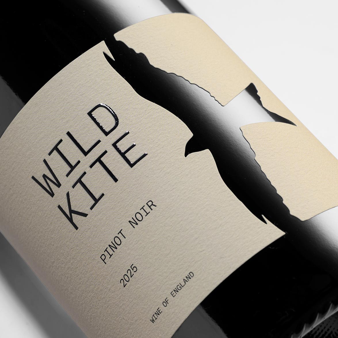
Wild Kite
Branding & Labels
Mieko Shimuzu
My Tentacles
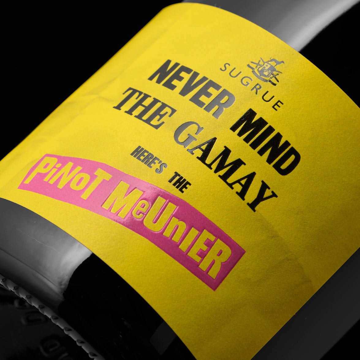
Sugrue South Downs
Never Mind The Gamay
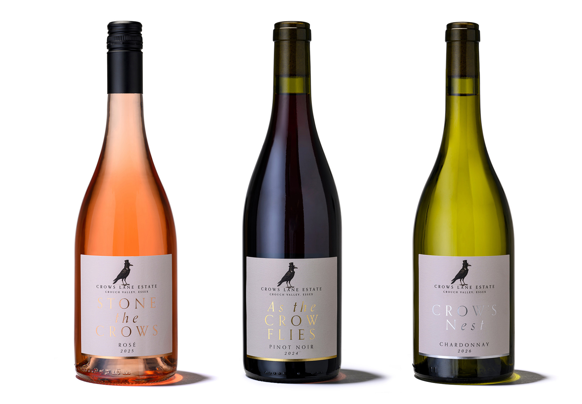
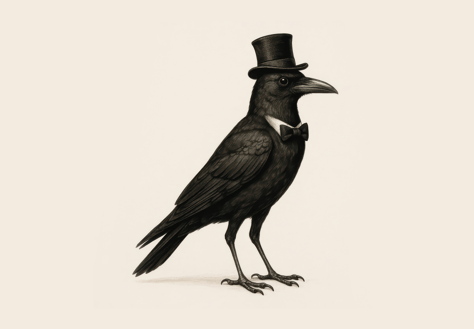
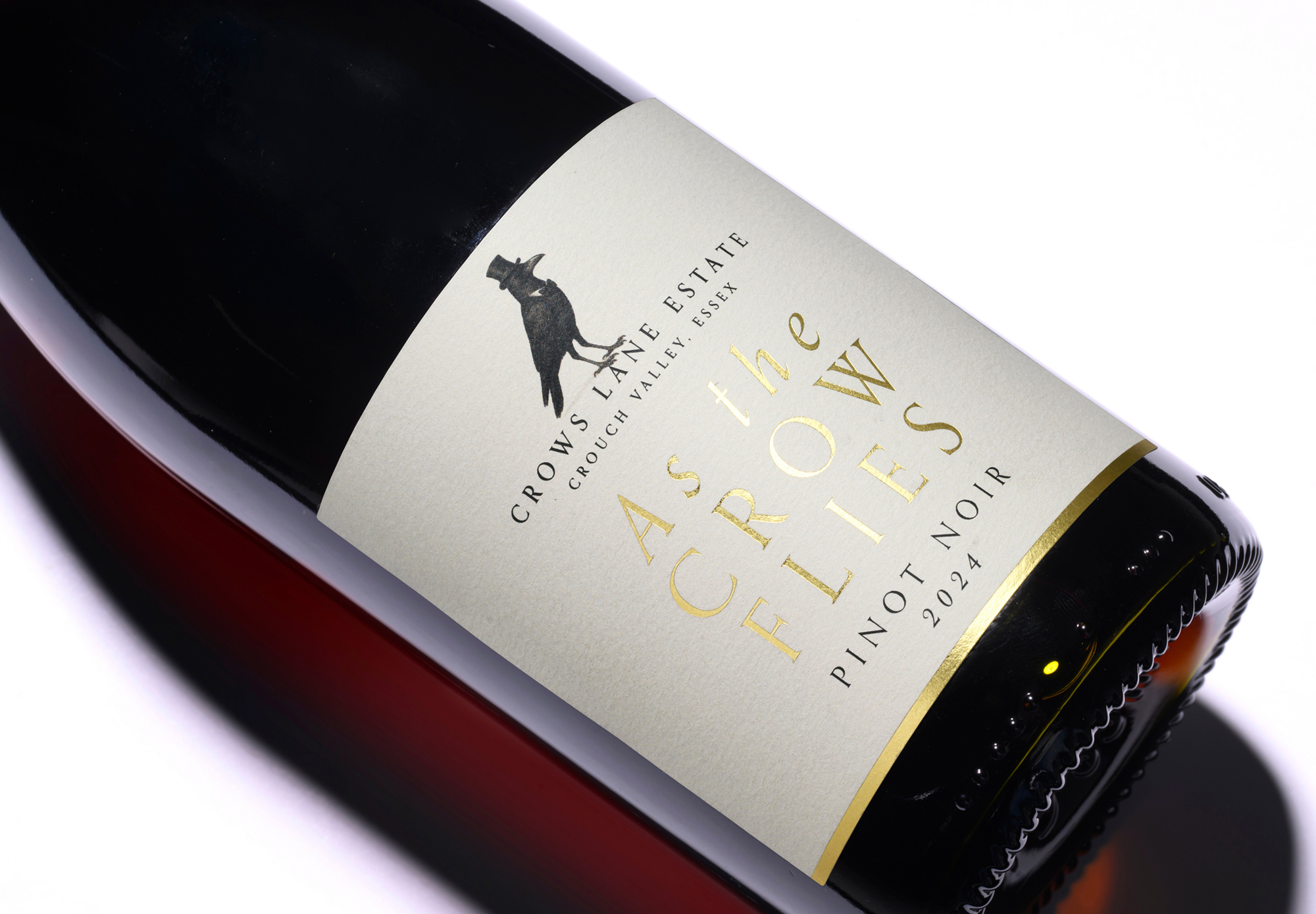
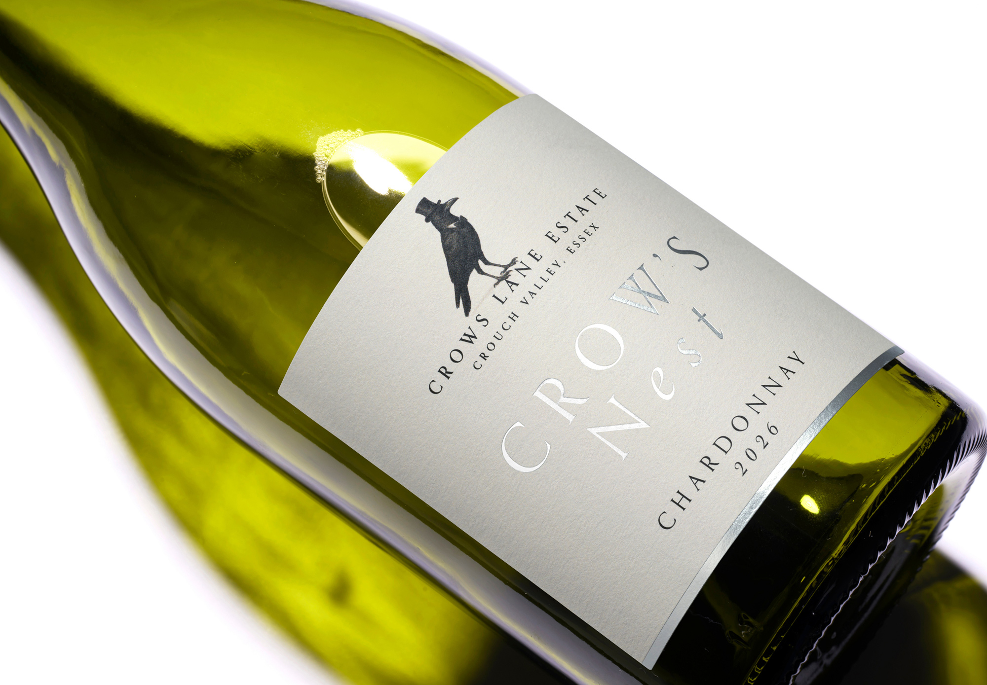
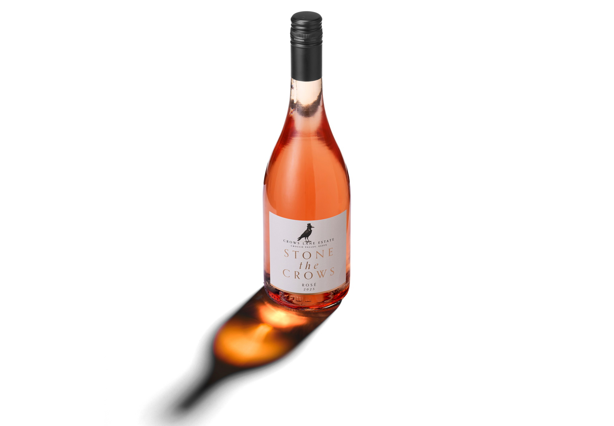
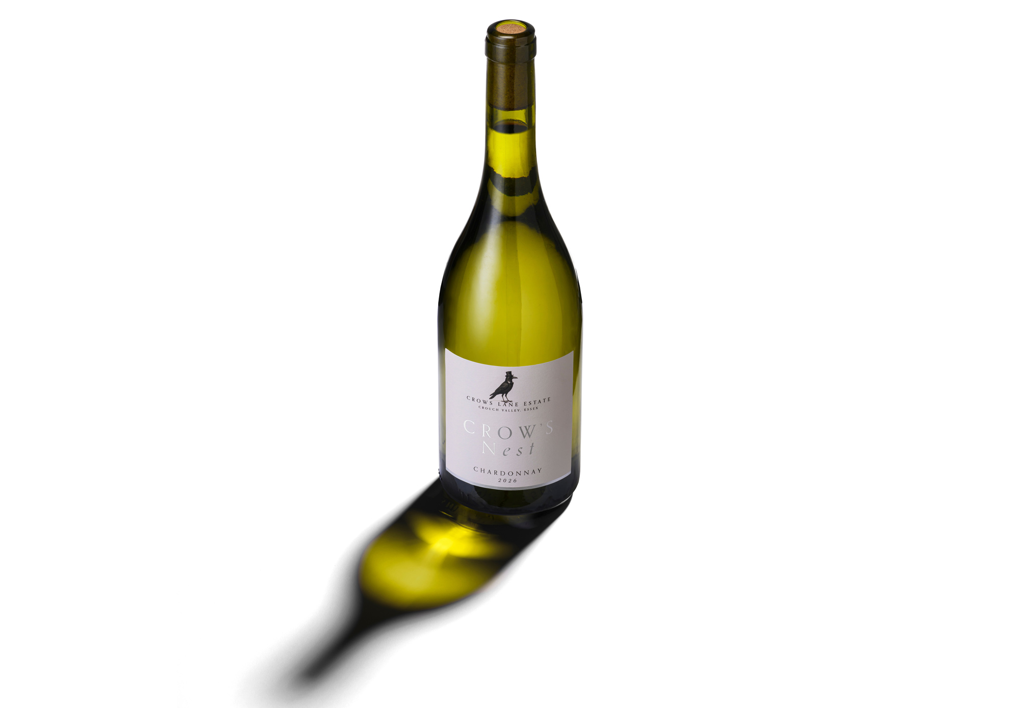
Crows Lane Estate
Wine Labels
Wonky Plonky Electronk
Club Night Branding
Carvers Hill Estate
Wine Labels
& Product Photography
Sugure South Downs
Sugrue Still Wines
Vinescapes
Branding Design
Hollands Vineyard
Wine Labels
Gaming Mail
Brand Identity
Gorilla Spirts Co.
Lu Yu Tea Liqueur
Refecktor
Elegant Wasted Album
Session Spirit
London Dry Gin Label
The Pig Hotels
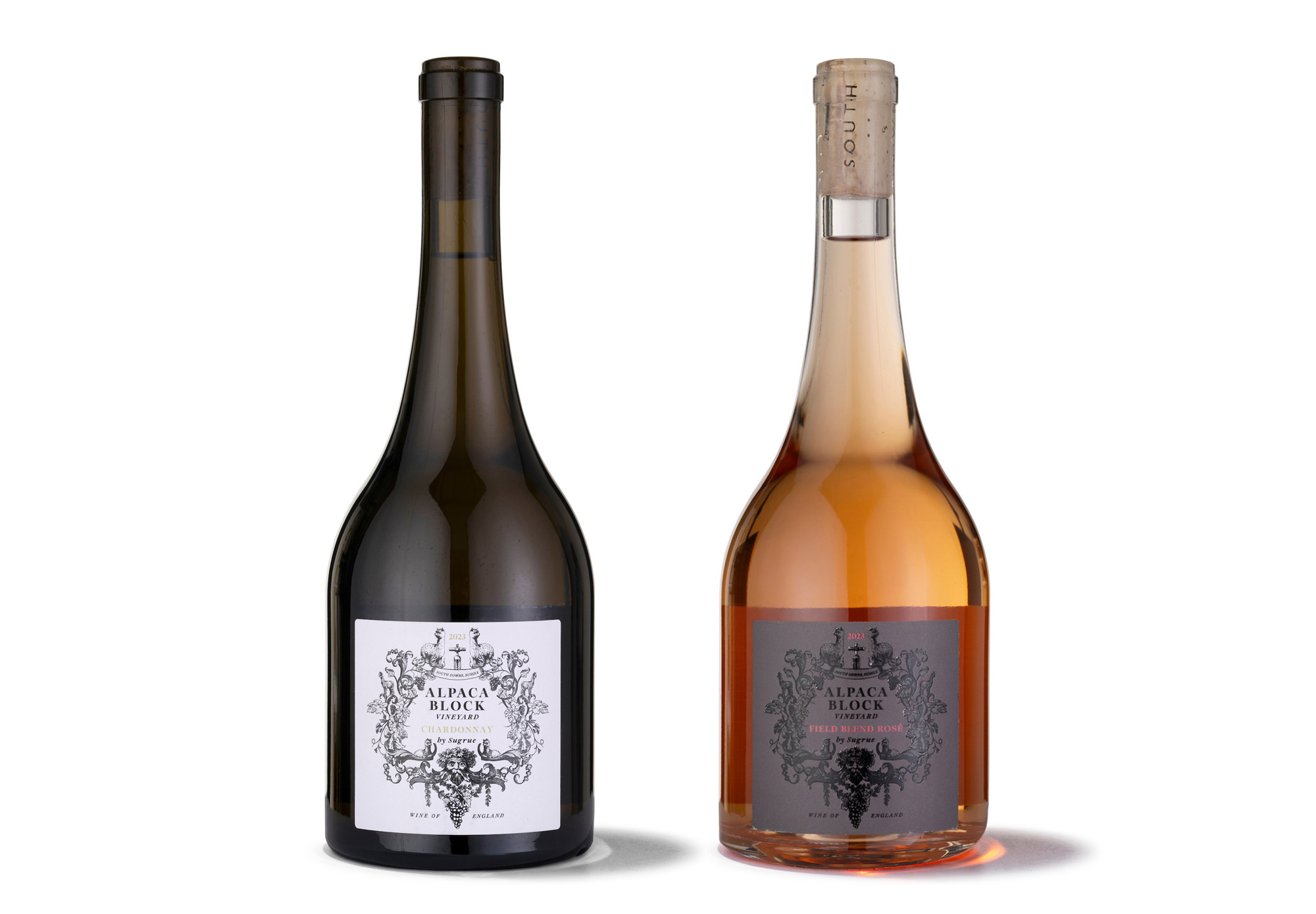
Alpaca Block Wine Labels
Hop Fiz
Branding & Can Design
DashCorps Brand Launch
Door Dash
Gorilla Spirits Co.
Maraba-Liqueur
Emma Rice
Winemakers Reserve
Buckingham Palace
Coronation Dry Gin and Navy Rum labels
The Hand and Flowers
Label
Bolle Wines
Bolle Spritz Classico
Vinescapes
Regeneration Wine Labels
Hattingley
Limited Edition Labels
Gorilla Spirits Co.
Silverback Gin Redesign
Selected logos
and marques
All Angels Vineyard
Classic Cuvée
10 Year Anniversary Release
The Great Transition
Film Titles
Sugrue
Rosé Ex Machina 2018
Labels
Gorilla Spirits Co.
Karisimbi Rum
Labels
The Heretics
Acid House Wines
Branding & Labels
The Palace of Holyroodhouse
Dry Gin
Labels
All Angels Vineyards
Labels
Film Posters
Art Direction
No Trace Promotions
Branding
Hattingley Valley Wines
Packaging & Photography
Hattingley Valley Wines
Advertising
Hattingley Valley Wines
British Airways Social Films
Shaviram Developments
Century Court Branding
Stratfield Fairlane
Branding & Illustration
Pete Marett Music
Branding & Website Design
Hattingley Valley Wines
Luxury Gift Boxes
Mieko Shimuzu
Album Artwork
Glass & Wick
Seasonal Logos
Mr Hobbs
Gin Liqueur Packaging
Moon Roast Coffee
Branding
Mode Recruitment
Branding & Website Design
Little Soho Voices
Branding
Tweseldown Racecourse
Branding
Ripples Bathrooms
Summer Sale Campaign
Civilised Humans
Branding & Art Direction
Ripples Bathrooms
Winter Sale Campaign
Midnight Pictures
Branding
Hattingley Valley Wines
Six Bottle Case
Blue Peak Accounting
Branding
Gorilla Spirits Co.
Ten Shilling Gin Packaging
Ripples Bathrooms
Shower Sale Campaign
Veterans For Gun Control
March For Our Lives Campaign
Hattingley Valley Wines
Single Bottle Gift Box
Shaviram Developments
Bryanston Court Branding
Newbridge Advisory
Branding
Maxwell Interiors
Branding